
Mendix Low-Code Intermediate – Customising Your Styling

Welcome to our Mendix Intermediate series! Building on the success of our Fundamentals tutorials, we’re excited to bring you Series 2, where we dive into more advanced topics to further enhance your Mendix development skills. Sticking to our usual format, this series includes both blog posts and step-by-step YouTube videos, allowing you to choose the learning style that suits you best. In this blog—and our first episode—we’ll explore custom styling in Mendix. You'll gain a deeper understanding of how custom styling works within the Mendix application development platform, with the option to follow along visually via our video tutorial.
Mendix Atlas UI Kit
Atlas UI is a pre-built UI library that is used by default in Mendix applications. The Atlas UI design system is modern, sleek, and simple and allows you to easily tailor the look and feel of your Mendix applications and solutions, from simple tweaks to full customisation. Out of the box, you can use pre-built templates, building blocks, and page layouts for great responsive web, native mobile, and PWA solutions.
New applications are built on top of the default design library, so the design can be fully tailored and extended to suit your use case. Mendix Atlas UI is based on three principles: simplicity, harmony, and flexibility. Simplicity focuses on keeping the framework minimalist. By reducing complexity, building apps can become a faster process; harmony focuses on maintaining a consistent look and feel across pages to ensure users are familiar with you application; and finally, flexibility is provided by the responsiveness of the library, allowing the app to scale whether on desktop or phone. By promoting these three principles for design decisions, Atlas UI provides a foundation for you to adopt sustainable design practices in your own Mendix applications.
Atlas UI gives you the ability to work with these three principles through the design properties. In our video tutorial, we show you how to add your own logo into your application using the Atlas UI custom variables, providing a corresponding look by applying the logo across the pages in the application. Additionally, we show you how to add fonts to your application, most notably by using the Google Font Library. This can replace the default Open Sans font to give your application a new font look.


Page templates
Page templates can help keep the harmony in your app. A template provides existing styling that can be used straight away on a new page. Once the template is in use, you can add, update, or delete components to meet the needs of your application. By using page templates as a starting point for creating new pages, common designs can be mapped out, saving a lot of work when creating new pages.
By default, Mendix comes with several Atlas page templates that can be found in the marketplace modules downloaded into your project. In our video tutorial, we use a dashboard page template to redesign our events dashboard. These page templates come with classes that have been added within the Atlas UI Kit, giving them a custom design that can be copied over to your own application pages. Along with the page templates provided by Atlas, you can create your own custom page templates. This allows you to maintain your design quickly and consistently across new pages.
Widgets and building blocks
Widgets have pre-existing styling to speed up application development. Widgets have design properties that allow you to make UI changes and add custom classes for deeper design customisation. The design properties in widgets allow you to change the styling of elements on your page on an individual basis. Because this affects individual instances of widgets, you will need to change the design properties of widgets on other pages if you want to keep the styling consistent. So, while styling can be applied directly to individual widget instances, it can be difficult to maintain as your application grows.
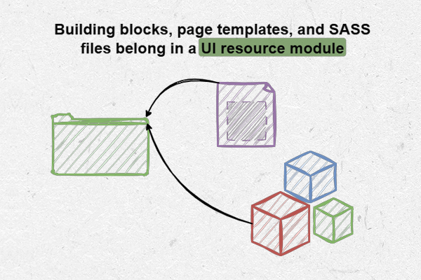
Building blocks allow you to drag and drop multiple UI elements onto your page. The focus of building blocks is on design rather than functionality, so they should be generalised so that they can be used anywhere in your project or even exported to other applications. Building blocks should be located within UI resource packages and are an efficient way to reuse styling without having to manually change individual widget design properties.
Design mode
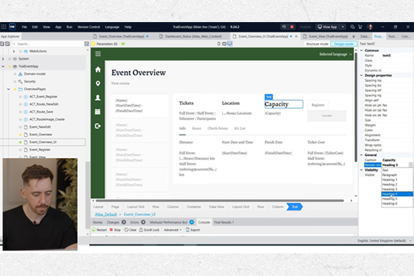
As you’re implementing and refining your styling, wouldn’t it be great to see a more simplified view of your app as your end-user might see it? Design mode in Mendix gives you this! By switching to design mode, you can get a visual representation of how the page will look like without having to run your project. Design mode also allows you to modify the design properties of elements on your page and preview the changes in real time. Design mode also allows you to view the page as it would appear on phone, tablet, and desktop, allowing you to verify the responsiveness of your application and ensure that the design is appropriate across devices.
An additional feature from Mendix 10.9 onwards, is that design mode includes the X-ray feature, which allows you to view elements such as data grids and containers on the canvas without having to switch back to structure mode. The X-ray feature keeps the styling on your page, allowing you to quickly modify elements to see any styling changes. This provides a hybrid view where you can see the styling alongside the functional details of the widgets on the page.

Custom UI resource module
For consistent, scalable styling, it is beneficial to create your own UI resource. By creating your own UI module, you can be export it to other applications if you want to maintain styling across your portfolio of projects. In your newly created UI resource module, you should store all your styling-related documents, including page templates and building blocks. While you can also add pages and microflows to UI modules, this makes maintainability more complicated. Therefore, restricting the contents of your custom UI modules to styling documents is recommended.
In our video tutorial, we show how to create your own UI module that extends the styling provided by Atlas UI. This allows you to customise and add more to your UI using SASS (Syntactically Awesome Stylesheet). By modifying or creating new CSS classes, you can have full control over the design of elements on your pages.
Any changes to existing styling should be made in your custom UI module. This means that your files won't be overwritten in the event of a future update to Atlas UI. For improved maintainability, the same name and file structure should be used in your custom UI module as the Atlas UI module. This makes it easier for other developers to understand where styling changes have been made.
Like any other module, a custom UI module can be exported and uploaded to the Mendix Marketplace for public or private consumption. This is useful for when you want to create and use a company-wide UI resource. When a custom UI module is imported, it will automatically overwrite the default styling and update the theme of your application.

Recommended best practices
In our video tutorial, we share valuable tips and techniques to streamline the design process and enhance efficiency. Keep these best practices in mind when styling your application:
- From Mendix 9 onwards, you don’t have to re-run Mendix every time you modify a SASS document. Instead, the document can be saved, and it will update in the local project that is already running.
- Adding styling directly to widgets is not recommended, as this is not a scalable way to change styling. It is more sustainable to use a custom UI resource module to maintain consistent, scalable styling.
- Using the “Inspect” element in your browser allows you test out styling changes without making permanent changes to your application.
- An underscore at the beginning of a styling file tells SASS that it is a partial file. When importing partial files into other SASS documents, remove the underscore in the import statement.
- Instead of creating new classes, try to use existing variables to keep the application consistent. You can use these variables (located in the custom variables SASS file) to ensure that any changes made to the styling will update all classes that use those variables.


What next?
Enhancing your Mendix application with customised styling is just the beginning of creating a standout user experience. As you continue refining your design skills, be sure to explore the various learning paths Mendix offers. If you’re working with older versions and need guidance on applying SASS, our dedicated blog post has you covered.
Looking ahead, our next tutorial will explore marketplace modules that bring additional functionality, such as Excel import capabilities, into your application. Stay connected by subscribing to our YouTube channel, where you can follow our Fundamentals and Intermediate series for more insights.
We’d love to hear from you! If you have any questions or feedback, feel free to reach out. Don’t forget to check out the full tutorial on YouTube and stay tuned for more exciting content!
More from Knowledge Hub
Continue exploring insights and strategies