
Designing Mendix Apps with Inclusive Accessibility


Every modern website and application built has to be as inclusive and accessible for as many people as possible. This must be in any designers mind when developing a website or application. I am going to be focusing this blog post around the font size aspect of Mendix’s accessibility.
What’s the issue?
It is very common for users to have their browser settings set at a higher font size and its even more common for mobile users to increase their font size throughout their device. (* https://www.cnet.com/how-to/an-easier-way-to-adjust-font-size-on-ios-8/) Users would have the expectation that all websites/apps will respond to these text size changes. Unfortunately out the box Mendix does not do this. This is due to the font size being set in pixels within the style sheet. Meaning that it takes precedent over the text size coming from the browser which the user has set.

What’s wrong with using pixels?
Every developer is brought up using pixel, its easy to understand and easily translatable. Most developers, when they are introduced to any type of styling, will use pixels and its easy to continue that practice. As you can see in the above image, the font-base-size is set to 14px. That means the font-base-size will ALWAYS be 14px, regardless what the user sets their default font size to.
How can we fix this?
So what we want is an app that changes it’s font size based on the users preference. So how do we use the text size rather than overwriting it with our own? One way to do this is to use ‘rem’ rather than ‘px’. Rem values are relative to the root HTML element and lets you specify a text size in a relative fashion.
1rem is equal to the font size set in the HTML. i.e. if the font from the browser was 16px, 1rem would equal 16px. (A browsers default is usually 16px). To simplify things, its best to set the font size in the HTML to 62.5%. So that 1rem is equal to 10px; this makes things easier for text size calculations: 1rem = 10px 1.4rem = 14px and so on.
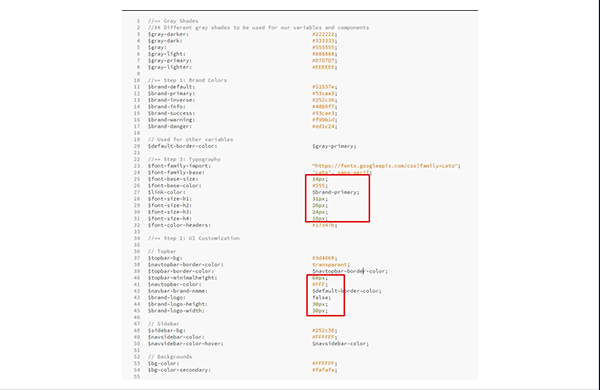

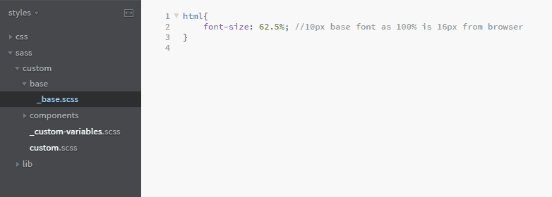
Both of these will give the same results. However, by using rem instead of px you allow the user to have control over their font size rather than setting it for them. To use rem rather than px we must first update the font-size in the HTML. By default in the Mendix style sheet lib folder this is set to the $font-size-default (which is set in px). As mentioned earlier, we need to overwrite this in our custom Sass folder to use percentage (shown in below)
The Mendix/Bootstrap issue
You may have noticed if you tried to compile your Sass, that you will get the following error: Incompatible units ‘rem’ and ‘px’
In the Mendix lib folder lib/components/_buttons.scss there is the following code as shown:
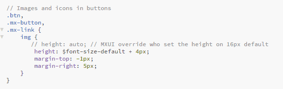
As you can see, its adding the font-size-default (which is now set to use rem not px) and +4px. This is what is throwing the compile error as you can’t use rem and px together. So its best to add back in the commented out line and remove the offending line. And there we go! Once you have complied the Sass, your Mendix application will now be fully accessible for users who change their font size!
Any other benefits of using rem over pixels?
There are also other benefits of using rem over px which is more than just for changing font sizes…for instance, using rem instead of px for your padding, logo width, layout spacing etc. This will make the whole application responsive to the size of the browser the user is viewing. And, rather than using media queries for every different element in your style sheet i.e. for increasing the base font size on mobiles, it will only take one media query in the base HTML. This will update what the base font size is and therefore will update throughout the application, saving you having to write a lot of media queries and only one place to manage the base rem size.
More from Knowledge Hub
Continue exploring insights and strategies